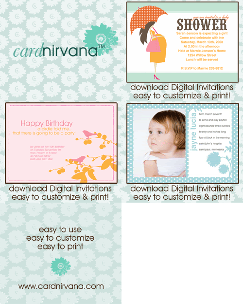

I decided to keep it simple and just focus on a few things from the ad. I chose to focus on color and some of the simple bold text. I love this ad because I think it is really versatile. I like the idea of doing a lot of little photos down at the bottom to mimic the layout or just doing a sepia tone layout with one color popping. Check out the gallery to see the rules and prize for this challenge!


3 comments:
Love that cute photo and what you did to add to it. Great inspiration.
this is so cute, carina!! love what you came up with ;)
Carina, this is one of my favorites! It is so beautiful - I miss your girls!
Post a Comment